AETHER
Date:
Jan 10, 2026
Client:
AETHER Architects
Industry
Luxury Architecture
Project Duration:
2 Weeks
Short Description:
AETHER represents a paradigm shift in architectural branding. Instead of focusing on the walls and mass, this identity highlights the 'Negative Space'—the ethereal void where life happens. A minimalist study in engineering precision and atmospheric luxury

The Case Study:
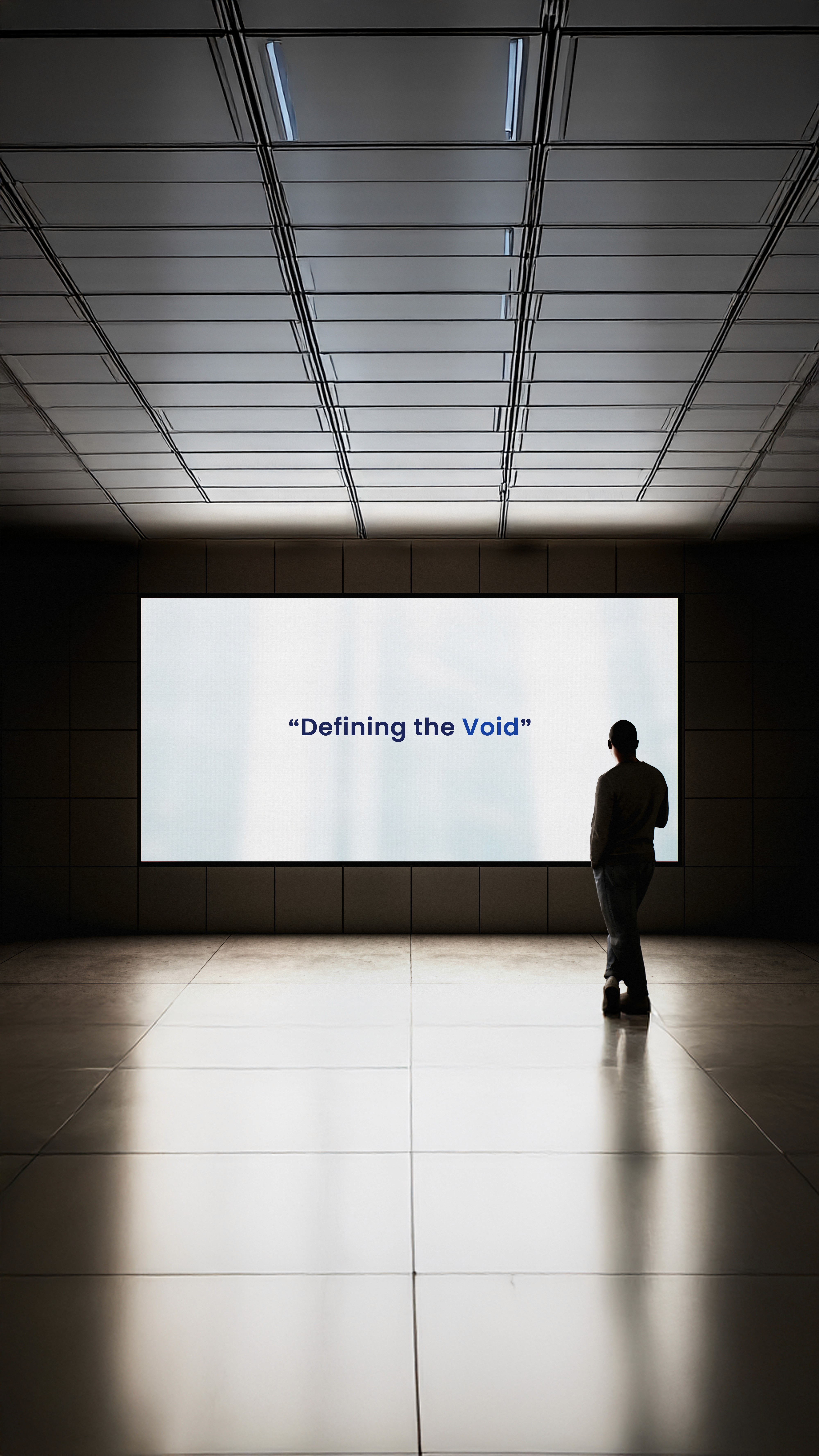
The Philosophy: Mass vs. Void While the architectural world obsesses over the mass—concrete, steel, and stone—AETHER focuses on the void. We believe that the true essence of a space is not defined by the barriers built, but by the openness created between them. The concept draws inspiration from the ancient "Fifth Element," the pure essence that allows light to travel.
The Logotype: Sculpting Space The visual identity translates this philosophy into typography. By deliberately removing the crossbars in the letters ‘A’ and ‘H’, we transformed static characters into open gateways. This reduction is not just stylistic; it creates "Negative Space," symbolizing open doors, windows, and the free flow of air and light.
The Palette: Structure & Atmosphere The color system is a duality of the physical and the ethereal:
Deep Navy: Represents the solid, unyielding mass of the structure.
Luminous Blue: Represents the 'Aether'—the atmospheric soul that brings the building to life.
The Result A brand identity that whispers rather than shouts. It appeals to a high-end clientele who understand that true luxury lies in space, silence, and precision.
The Challenge:
To create a distinctive brand identity for a high-end architecture firm that avoids the common clichés of rooflines and skyscrapers, while communicating a deep understanding of spatial philosophy.
The Solution:
We adopted a subtractive design approach. Just as an architect carves space out of matter, we carved parts out of the typography. The resulting mark is a testament to 'Quiet Luxury'—sophisticated, minimal, and structurally sound.
Summary:
AETHER challenges the traditional architectural focus on mass and structure by highlighting the power of the void. This visual identity explores the concept of 'Negative Space' through custom reductive typography, symbolizing the seamless flow of light and air. The result is a brand experience that embodies quiet luxury, balancing engineering precision with atmospheric depth.